Centered Chiropractic
Changing the way chiropractic care is viewed is difficult, especially for a pre-existing center that has come under new ownership. The new owners wanted to attract and retain lifelong clients, but also had a new approach to the way they ran the clinic. The website redesign, along with a new brand direction, stands out against the crowd in a sea of confusion, reforming how Centered is viewed as a business and increasing the number of ideal clients.
Tools Used: Adobe XD, Adobe Photoshop, Adobe Illustrator, Lottie
The Team: Design Director ✸ 2 Designers ✸ Developer
My Role: UX Research ✸ Brand Direction ✸ Graphic Design ✸ Icon Design ✸ Interaction Design ✸ Prototyping ✸ Mobile Design
Timeline
2 weeks initial meetings and research → 2 weeks brand identity/direction → 1/2 week design system → 2 weeks wireframes and prototyping interactions ✸ 4 weeks finalizing website with stakeholder feedback
Strategy
Modernize
With a change in ownership of the center, the new team had a unique approach to chiropractic care that they wanted to showcase on their website, in order to attract a new generation of clients. A complete brand revamp was done, and an integration of the new branding into the website through graphics, interactions, and careful consideration of the user journey.
Healing as a Verb
Modernize the look and feel of the brand to fit with the new name and attract a younger demographic while still catering to the older, but faithful clientele. Create and integrate new brand guidelines within the website to add motion and life to the pages.

Promote a different outlook on chiropractors by avoiding any ideas about “quick fixes,” and focus on the idea of long term healing. The ultimate goal is to attract life long customers, not one-time customers.
Call to Action

Create an online experience that allows prospective clients to easily learn about their unique approach, the healing team, and book appointments.
Brand Design
The color scheme was highly influenced by the colors in the photography of the chiropractic center. Creating a calming feeling, with spa-like tones of mostly blue and green, along with a red that adds an extra pop of color.


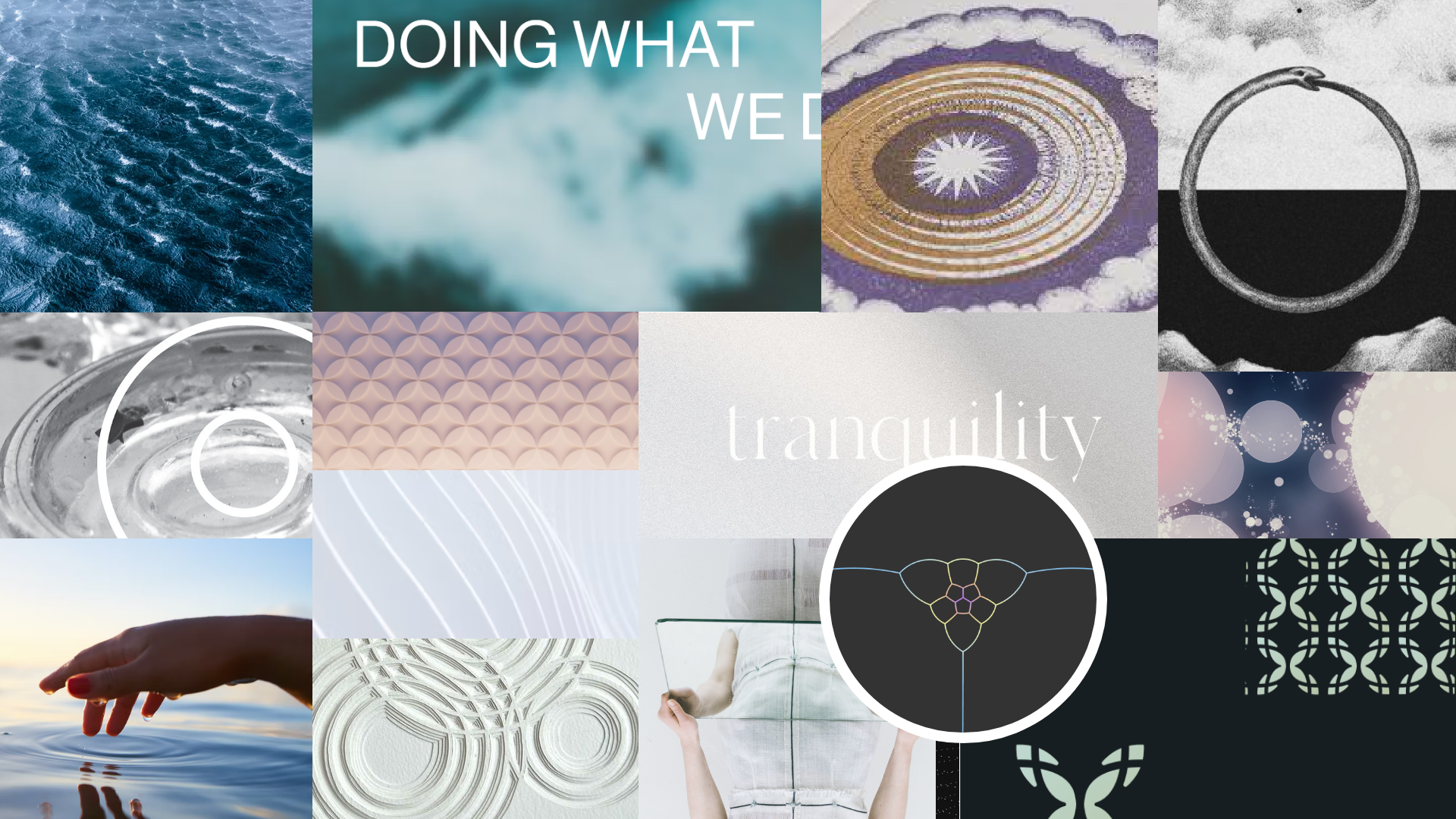
Getting Inspired
To create the brand direction, I found images within the tone I wanted to center the website in. The colors relaxing, and a focus on intertwining circular elements and things morphing into the whole.
Brand Elements
The Centered owners wanted to integrate sacred geometry into their brand. In order to feel more elevated, and less cheesy, the elements are subdued and are incorporated in a subtle way throughout the site.
The gradients are also used through the site to promote some texture and add a calm feeling throughout.


Design System
Though a smaller site, I always believe in creating a design system for each website to allow for quick changes throughout each iteration of the website and setting guidelines for future pages to be added.
For Centered included defining the typography, buttons, drop downs, header/footer, and other elements such as the map in this case.

I integrated the brand elements throughout the site, which included applying the colors, typography, branded elements, icons, as well as integrating a variety of motions and interactions that tied into the brand.
Brand Integration


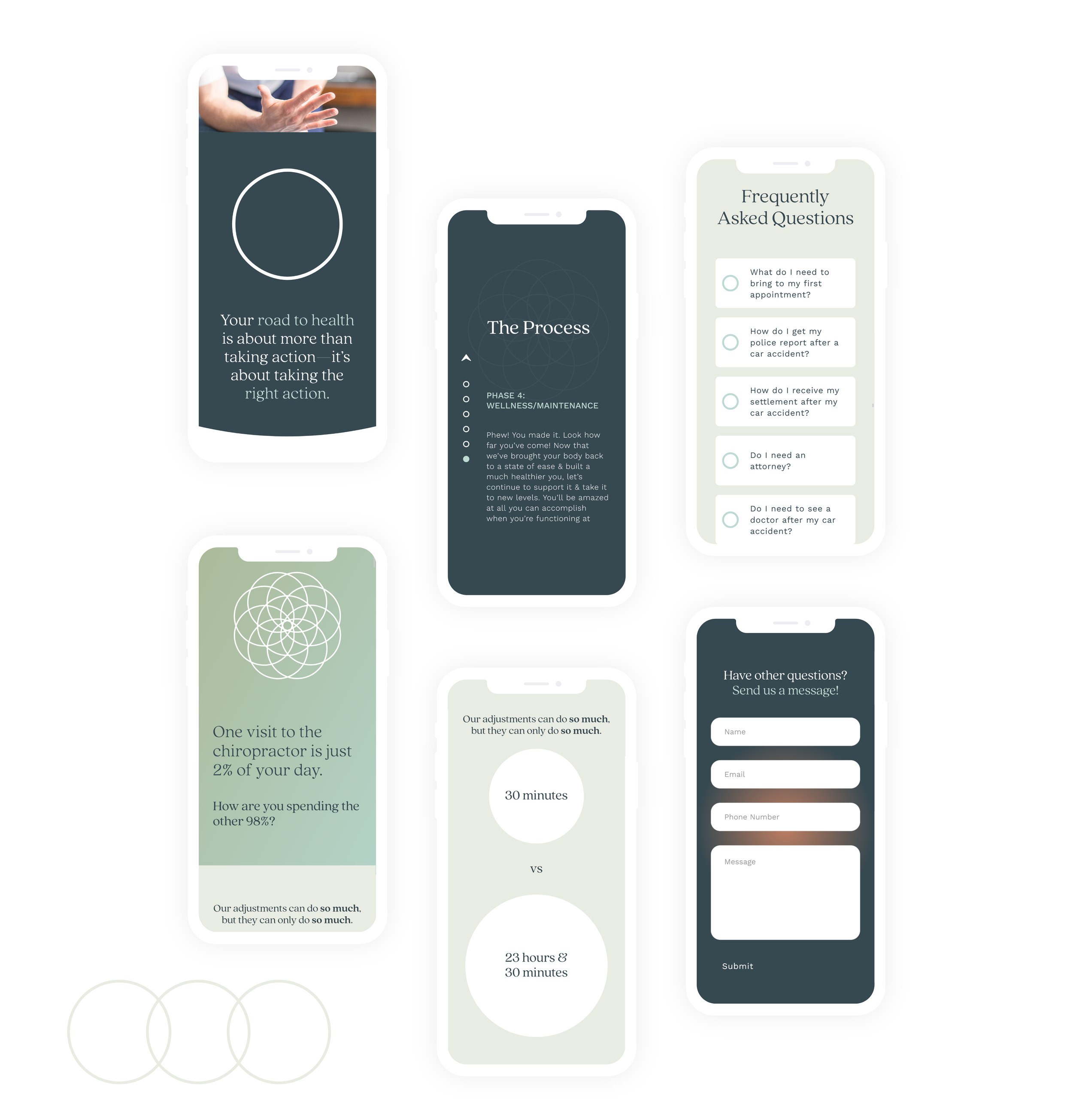
Each FAQ item has a circle that fills when clicked, the circle representing a sense of wholeness and trust weaved throughout the site. In this case, having your question answered provides a breath of relief.
There was a lot of text in this section, especially when it came to the four Pillars of Health that Centered wanted to represent on their brand. This area becomes a fixed-scroll, and users can read through the shorter blurbs that represent the brands four main pillars of health.
While designing, I believed that most of the text of this area will not be read through by most users. However, by making the main message stand out, I hoped to help lead the user’s eye toward something more easily digestible.

User Flow & CTA
Challenge → For the website, I was given pre-written copy by the client to use. Because of this, I had to be innovative in the application of copy, as I could only change the order of copy slightly. There was also an excessive amount of copy, more than I would suggest for not overwhelming a user.

After learning about the company’s values on the home page, guests are able to choose to book an appointment, or invited to learn more about the team.
User FLow
Leading the users throughout the website, I seperated chunks of copy into sections to help avoid information overload and direct the client to help them navigate. The background arrows also lead the eye down the page, a hint to the hex shape integral to the brand.
The deliberate use of call-to-action buttons helps potential clients navigate throughout the page. By first creating information architecture, I was able to lay out the user flow and what parts of the pages would work best with a call to action.

As the website was complicated graphically, the mobile design was made after the website prototype design was approved. However, the design prototype was made to be extremely responsive already, and the design system was easy to change for the mobile version.

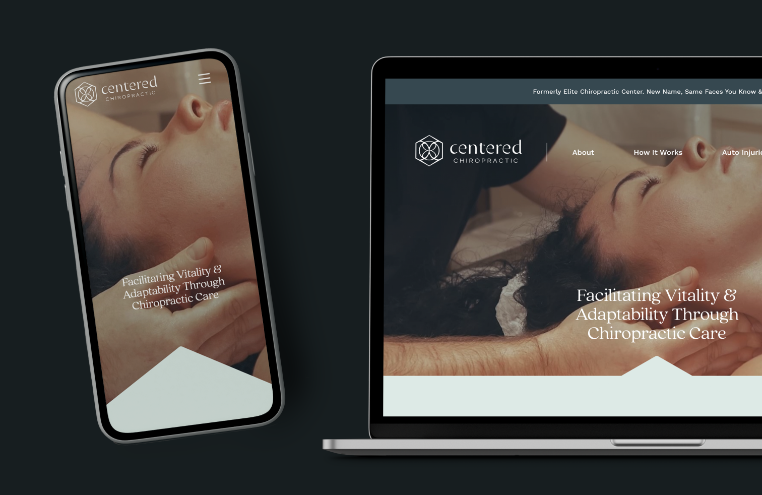
Mobile Version

Desktop Version
Mobile Design

After making the mobile design, I checked the website on different types of devices and made a few small adjustments with the developer. For example, this section has a large graphic as you scroll through the process. In the mobile version, I chose to make it more transparent in the background, but still visible.