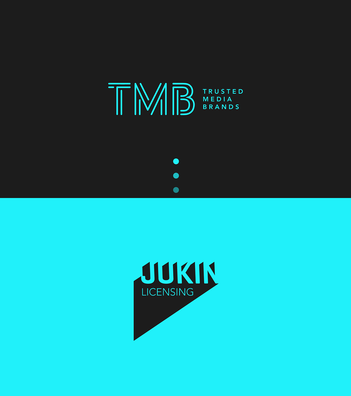
Trusted Media Brands
Increased B2B connections through motion-centered, bold web design
With the acquisition of Jukin Media in 2021, Trusted Media Brands sought a modern, motion-forward experience for digital consumers to interact with their brand. The print media behemoth transformed itself into a multimedia sensation with user-generated content at its core.

My Role: UX Research ✸ Design System ✸ Interaction Design✸ Prototyping ✸ Mobile Design
The Team: Design Director ✸ 2 Designers ✸ Developer
Tools Used: Adobe XD, Adobe Photoshop
Timeline
3 weeks initial meetings and research → 1 week design system → 1 week wireframes and prototyping interactions → 4 weeks finalizing website with stakeholder feedback
Digital strategy
Brand & Sub Brand Integration

Merge the TMB’s brand and its affiliated sub-brands into the website through unique typography and graphics, brand color application, custom-built interactions, and bold brand-aligned imagery.

Bold Interactions & Imagery

Incorporate the brand's forward-centered message through unique interactions, highlighting a new emphasis on the digital and user-generated content.
Design System for Rapid Prototyping

Create a design system which allows for rapid prototyping, a smooth design/iteration process, and quick implementation of the designs for the developers.
Targeting to a diverse B2B audience:
TMB wanted to advertise to these main three groups, which are broad in their age range, interests, and understanding of technology. They want to be viewed by all groups as a growing, expanding company building shared communities.
Advertising professionals
Investors/bankers
Job applicants
Starting point: a static website
Site extremely static, looks dated
Lacks interaction, video, and movement
Does not integrate the core branding through the website through interactions, imagery, typography, graphics or colors
Information overload - lots of info condensed in one area is overwhelming
No representation of data or numbers to show B2B growth and impact of the brand
Lack of user generated content

Unifying sub-brands and overarching brands
One of the biggest design challenges was how to combine the new era of TMB in a way that showcased them as a unique entity, while highlighting the unique brand positioning of each sub-brand.
The TMB brand signifiers of the website include the stark dark background with the brand colors as highlights for links and graphics. The sub-brand pages incorporate these elements, but also have their own unique brand colors infused in sub-brand pages.

Due to budget limitations and limited developer time, as designers we knew we couldn’t display sub-brand data in a hyper-accurate way. The data also couldn’t be tracked in real-time.
We brainstormed a way to showcase a way to make each brand stand out despite these limitations. Featuring each brands’ colors, this area displays a key data point that the brand wants to highlight, depending on how it is viewed, such as hours viewed, clicks, etc and the line becomes “bigger” as larger number data is imputed by the client.

Creating a unified design system
The design system was made before the wireframing and prototyping stage.
By interviewing the client, and reviewing the information architecture, I discovered the types of forms, buttons, and drop downs that would most likely be used throughout the site and made sure to implement them in the design system.


Implementing Motion
To give motion & life to the careers page, I wanted to showcase the passionate TMB employees in the work from home era, while also harkening to the new merger with Jukin with a reference to social media.
The TMB team loved the idea and asked a few employees to record a short boomerag for the Careers page that expressed an aspect of their personality.


✸ This area also solved an issue where TMB wanted some less significant brand colors (orange and blue) to be implemented in the site, but the color scheme had already been approved for the rest of the website, so I added the colors in a more subtle way.

I created this area on the About page that features some TMB brand videos with a subtle parallax that adds motion and dimension into the page. It features random videos/photos from a variety of user generated content.
To implement motion into the designs, I met with the developer and described the way I wanted it too look (subtle zoom and parallax.) After it was coded, we fine tuned the exact timing together.
On hover, the dots grow bigger, a conceptual representation signifying how more viewers, more user submissions, and more clicks are happening every day for TMB - an important signifier for investors looking to partner with the brand.
Accessibility
Though accessibility wasn’t a client priority, I always like to consider the users and the general functionality of the website. The client really loved the bold dark background, though dark backgrounds can cause major eye strain.
Readability: Making sure that the text size was increased across the website, especially on clickable areas.
Contrast Ratio: Determining a proper contrast ratio for the white text on black background
Highlight colors: Picking highlight colors from the TMB brand guidelines that had a high contrast ratio (lime green and bright blue)
Screen Readers: Making all text on the site able to be read by a screen reader, rather than text on an image, where the previous website had many such cases.
Results
The redesign led to a website that aligned to Trusted Media Brands’ vision, and led to an increase in connections to brands and content creators.
The addition of movement, interaction design, and unique graphics gives life to the site, and integrantes the brand in an organic way, leading to increased brand recognition.
The information is displayed in a much more concise and easier to navigate way, and centered more around the user generated content and data that is the keystone of the brand’s business.
The new site promotes and supports the continued growth of TMB, especially when it comes to an increase in the viewer data, an expansive design system for any new pages, and allowing for easy swaps and integration of user generated content.